When opening Kunstsilo will be for all to enjoy, a place for discovery, reflection, entertainment and social events. Offering a new perspective on Nordic culture – its influence on the World and the World’s influence on its people. The museum’s ambition is to inspire future generations through cultural reflection; a public space for young and old. A destination for locals and international visitors alike, a major institution for all Nordic countries on the world stage of Art and culture.
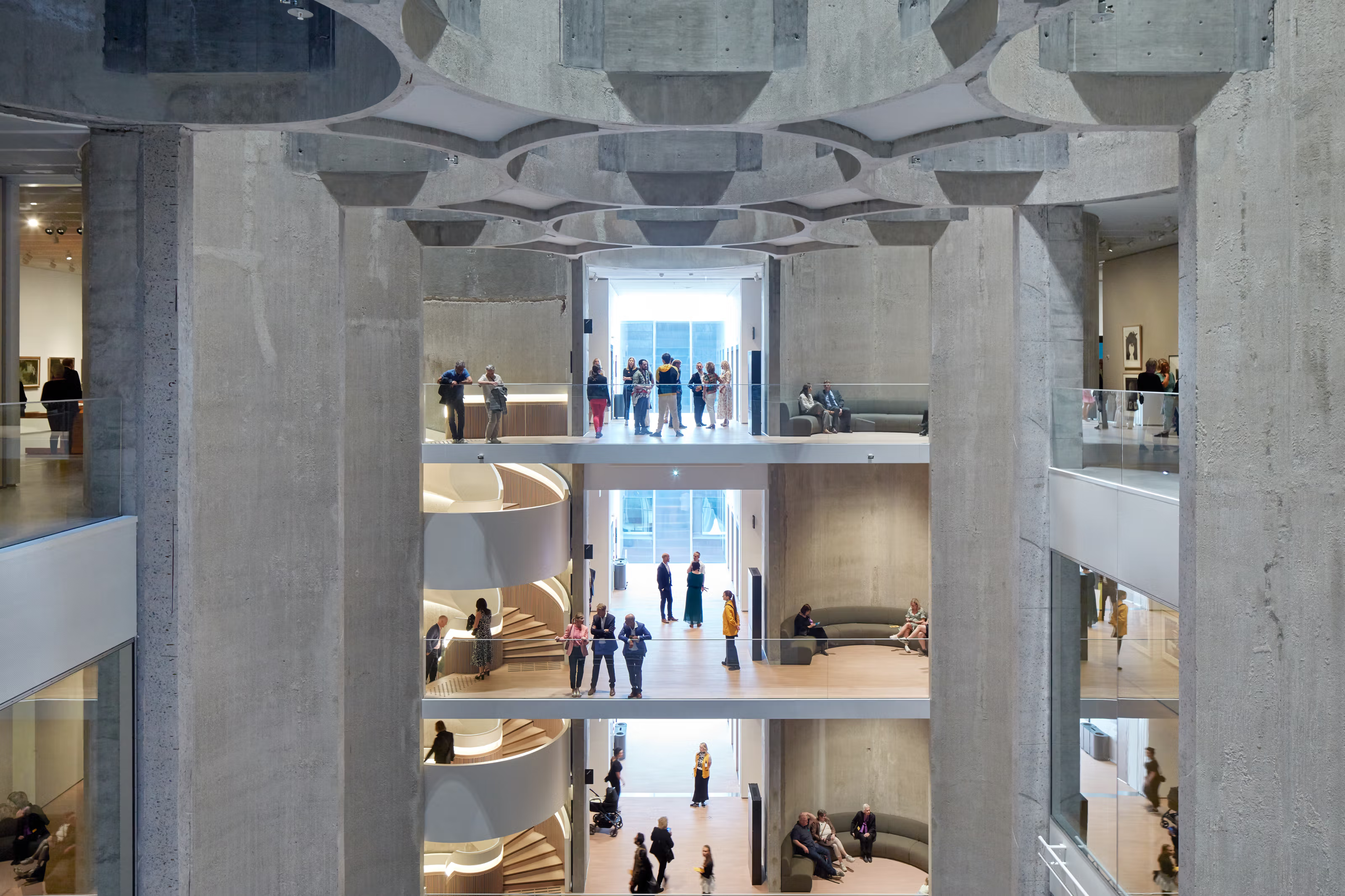
The building is an awe inspiring space, a converted grain silo opened in the centre to create a vast scale of experiences – the reinvention of a local landmark brought back to nourish the community in new ways.
With such magnificent ambition and cultural importance, Kunstsilo requires a brand identity that does not distract from the visual wonder and discovery it has to offer and will continually grow. A marque that tells a simple story to capture imagination, with the strength of character to stand the test of time.
The result is a perspective shifting identity that cements the iconic architecture of the silo and creates a platform for creative expression and communication.
The visuals in this article are example images and not real products or upcoming exhibitions.
–We are very excited and look forward to making use of our new visual identity. The purpose of a visual identity is to communicate what we stand for, who we are and what we can be for our guests. In close partnership with ANTI Bergen and ANTI Trondheim our whole organization has taken part in building a strategic platform to develop our brand. This has served useful in defining a framework for how Kunstsilo will communicate going forward.
Kunstsilo aims to be a welcoming place for everyone as well as a powerhouse for arts and culture. It has been an exhilarating and challenging two-year process for the organization, resulting in a strong bond between the brand itself and the organizational culture. As a brand Kunstsilo’s purpose is to shift perspective, and we find that the identity is a creative and constructive tool which gives us new opportunities for everything we do internally, with our partners and our guests.
– Eldbjørg Dahl – Commercial director at Kunstsilo
The tall proportions, cylindrical forms, striking voids and modernist-impact have all inspired the creative platform. The visual strategy of ‘Shifting Perspectives’ comes to life through the core visual language.
The Kunstsilo symbol is a graphic representation of the silo’s cylindrical form. The story of ‘Shifting Perspectives’ is embodied in the symbol through a distortion of perspective – representing a ‘point of view’ that can change. In its static state it creates an optical illusion of depth that distorts the viewer’s perception of space and dimension – a complex quality made simple.
– Our ambition for the logo was to create a mark that could transcend time and last indefinitely into the future. A symbol with the strength to live on, in some format well into this century – with space for the design world it exists within to be able to evolve and flex with the times. The intrinsic connection between the museum name, its location and the architecture – means the museum is likely to never move and exist in another location or building. This drove the opportunity to develop a logo that reflected both the strategy and the iconic features of the architecture. The resulting logo captures a boldness and simplicity that will enable it to function as a stand alone symbol (without the wordmark) over time.
– Mark Trzopek, lead designer at ANTI
The Kunstsilo hero typeface ‘Silo Display’ has been designed specifically for the museum and can be used across all types of communications. The design has been inspired by architectural features of the silo building – with a condensed proportion, bold weight and design features that echo the contrast between rounded and squared angles in the building or the concave junction points where silo cylinders meet. A key signifier in the brand identity ‘Silo Display’ has a modernist reference to the museum’s wealth of 20th century art.
The Kunstsilo colour palette brings energy – capturing the essence of the museum’s personality, the golden grain that once was stored in the silo, and the bright and warm sun that Sørlandet is. The bold primary colours build recognisability of the Kunstsilo brand expression, with yellow as the main identifier of the brand.
The Kunstsilo brand pattern adds a depth to the visual toolbox of Kunstsilo, bringing to life the brand through further exploration of the silo’s form and architecture. This playground of the identity will be applied through varied aspects of the visitor experience; from static to playful interactive surfaces.
As a brand Kunstsilo need to transcend the incredible knowledge within the art world, but at the same time make art more accessible for ordinary people who have not yet had a profound art experience. So the way we approached the brand was to look at all the different perspectives of people to define how Kunstsilo as a brand can position itself in the world through many types of experiences, not just as an art museum.
– Stian Ward Bugten, som er Executive Creative Director & Partner i ANTI Trondheim
To learn more about the brand identity visit https://kunstsilo.anti.guide/